SARAH JOHNSON
SUPERVISING DIRECTOR - "Frog and Toad"
Series Development

During early development of "Frog and Toad," I tested out acting references to help guide the storyboard team. This test was to illustrate some key points:
-Staging with room to move within the scene.
-Moving with purpose/intent.
-Interacting with the environment.
-Showing Frog's springiness vs Toad's more careful movements.

Another key part of the show was establishing what the Title Cards would look like. I created this example (B&W top) as reference for the storyboard team and we utilized it in an episode. We paid homage to Arnold Lobel's illustrations whenever possible. Including the border at the start and end of episodes would also create a nice "book end."
Below is the reference I created for how episodes can end with truck out to the border treatment. Often these would also mimic the original book illustrations.

When it came to montages, we again saw potential to bring Arnold Lobel book borders into the show. Working with Art Director, Keika Yamaguchi, it was important the borders didn't feel like "comics.". We kept it one panel at a time and embraced empty white space. Showrunner, Rob Hoegee, also was leading us with keeping the show's pace gentle and slow so there was no need to utilize montages as a time saving device beyond condensing some "traveling time." I thumbnailed out this animatic early in production.
*video above - music kicks in at about 10 seconds
Art Director, Keika Yamaguchi, wanted to omit a mouth from mouse to keep the nose long and down. To make sure it would read in animation, I did this rough test with the designs from Wei Jean Tang. Voice by John Hodgman.
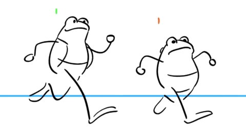
I animated this stick figure run cycle as a jumping off point for our animation team. I wanted Frog to look effortless and smooth and Toad the unwilling follower of his feet. Since Toad's strides are half the length of Frog's, I used a quicker pace in hopes that he could keep up with Frog better.
Frog and Toad were by far, the hardest characters to finalize their designs. Arnold Lobel's style was inconsistent across all the books and it was tricky trying to bridge them all to one cohesive happy medium. Eventually, I suggested we pick our favorite version and perhaps the most iconic instead. That seemed to help and get us to the finish line with the designs. Below are some notes I gave during the process of character designs. Art Direction by Keika Yamaguchi.


Our animation team led by Titmouse Vancouver Animation Directors, Jenny Weightman and Leah Clementson, at Titmouse Vancouver were complete all-stars. Our storyboards included minimal posing due to audio not being provided beforehand so we relied on our amazing animators to enhance the performance and plus the action. Below is a sample of drawovers I would provide when myself, other leadership, or studio executives, had specific requests for adjustments or technical notes.


I created a short “Storyboard Style Guide” to help set the vibe of the show (plus a few personal storyboard preferences thrown in...) I didn't want a ton of hard rules for the storyboard team, letting the show style evolve and solidify with everyone's voice. It was also an experiment to see how far we could push the tranquility and quiet moments between Frog and Toad. I feel the overall calm pace really made the contrasting comedy and action bits extra funny and exciting. There was some course correction along the way but growing pains are par for the course on a Season 1.
I designed and animated the end credits - adapting original Lobel illustrations.